A shared library of components, styles, and guidelines that ensures consistency and efficiency across products. It helps teams design and build faster while delivering a cohesive and accessible user experience.
The Nest

THE IMPORTANCE OF DESIGN SYSTEMS
The Craneware product suite is comprised of 14 legacy and cloud SAAS products that have been developed and delivered by various teams with very little UX and visual design support.
Our goals were to set and maintain design standards and consistency across multiple products. We did this though creating and maintaining design libraries in Figma, publishing component documentation, tracking and auditing new patterns, and performing extensive Design QA. Our work helped support the designers on the team, who were consistently designing and shipping new features.
THE PROBLEM
The drive for change came as a result of the business’ transition from legacy desktop applications to the cloud. During the development, as a greater number of products made the conversion to the Trisus platform, customers were facing inconsistency with the UI and had trouble navigating between products with confidence and efficiency.
As part of a dedicated design team, we identified a need for centralised and consistent components that could be utilised across the business.
UX AUDIT
To begin this project, we created a Trello board with components that were used across all of our Trisus products.
This informed me of the inconsistencies across the platform for the same component and allowed me to review against industry standards.

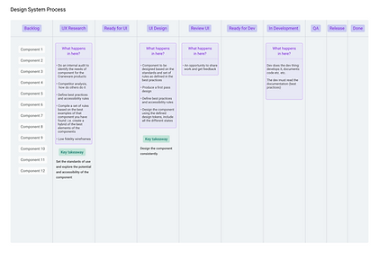
Individual components were then assigned to members of the team to conduct further research and document best practices, accessibility rules and patterns.
This started with some competitor analysis where I spent some time studying how other companies were designing and defining their components.


Based on findings from the competitor analysis, I put together best practices for components for other designers and developers to reference when they were adding them to any work they were doing.
I also had to check to make sure there would be no issues with accessibility when it came to the UI design, ensuring that the right colours, contrast ratios and visual cues were used.

UI DESIGN
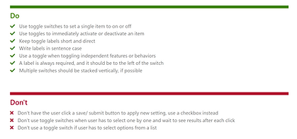
As part of the design process, I was able to work with the rest of the UX team to collaborate and receive feedback at the early stages of the UI design. We would discuss the details of the component, raise any enhancements and come to an agreement as a team on which version of the component we would use as the final design. For example, at the first stage of the design for the toggle the main colours that were used were Craneware’s brand colours of blue and green. This stated a discussion on if the toggle should use the same colour as selected components when it is switched ‘on’.

I was then able to create another version to take back to the team for further discussion.
As a team, we decided that consistency, the use of the secondary colour purple was the appropriate choice for the ‘on’ state for the toggle.
Before the toggle was ready to go to the delivery team, I defined properties for the component.
This would ensure that the engineers used the correct shades of colours for the hover, enabled and disabled states and that the sizes of the components were correct.

IN DEVELOPMENT
The final step of the design process is to create a TFS Feature so our delivery team are able to refine and create the component. At this stage, my role was to provide support to the engineer making sure that they had all the information they required for refinement and during the development.
